@font-face {
font-family: ‘eicons’;
src: url(‘https://plugin-cdn.monsterinsights.com/assets/fonts/eicons.eot?76342541’);
src: url(‘https://plugin-cdn.monsterinsights.com/assets/fonts/eicons.eot?76342541#iefix’) format(’embedded-opentype’),
url(‘https://plugin-cdn.monsterinsights.com/assets/fonts/eicons.woff2?76342541’) format(‘woff2’),
url(‘https://plugin-cdn.monsterinsights.com/assets/fonts/eicons.woff?76342541’) format(‘woff’),
url(‘https://plugin-cdn.monsterinsights.com/assets/fonts/eicons.ttf?76342541’) format(‘truetype’),
url(‘https://plugin-cdn.monsterinsights.com/assets/fonts/eicons.svg?76342541#eicons’) format(‘svg’);
font-weight: normal;
font-style: normal;
}
.mset-icon { font-family: ‘eicons’; }
.mset-icon-long-arrow-right:before { content: ‘\e804’; } /* ‘’ */
/* Base styles */
body {
margin: 0;
padding: 0;
width: 100%;
background-color: #f6f7f8;
font-family: ‘Inter’, ‘Helvetica Neue’, Helvetica, Arial, sans-serif;
-webkit-text-size-adjust: 100%;
-ms-text-size-adjust: 100%;
}
/* Image handling */
img {
border: 0;
height: auto;
line-height: 100%;
max-width: 100% !important; /* Force max-width */
outline: none;
text-decoration: none;
-ms-interpolation-mode: bicubic; /* Smoother resizing in IE */
display: inline-block;
vertical-align: middle;
}
/* Container styles */
.mset-wrapper {
width: 100%;
max-width: 680px;
margin: 0 auto;
padding: 50px 0;
box-sizing: border-box;
}
.mset-container {
background: transparent;
border-radius: 4px;
overflow: hidden;
width: 100% !important; /* Force width */
}
/* Header styles */
.mset-header {
background-color: #6F4BBB;
background-image: url(‘https://plugin-cdn.monsterinsights.com/assets/img/header-background-monsterinsights.png’);
background-position: bottom right;
background-repeat: no-repeat;
background-size: contain;
padding: 40px 30px;
color: #ffffff;
}
.mset-header-logo {
width: 160px;
margin: 20px 0;
}
.mset-header-title {
max-width: 360px;
margin: 20px 0;
font-size: 26px;
font-weight: 600;
line-height: 32px;
}
.mset-date-range {
display: inline-block;
background-color: #8E64E5;
color: #ffffff;
padding: 7px 15px;
border-radius: 4px;
text-decoration: none;
font-size: 15px;
font-weight: 700;
margin: 20px 0;
}
/* Content wrapper */
.mset-content {
padding: 30px 0;
width: 100% !important;
}
/* Footer styles */
.mset-footer {
background: #F3F5F6;
padding: 30px;
text-align: center;
display: flex;
flex-direction: column;
justify-content: space-between;
align-items: center;
}
.mset-footer-logo-image {
width: 60px;
height: auto;
margin-bottom: 20px;
}
.mset-footer-content {
color: #23262E;
font-family: Inter;
font-weight: 400;
font-size: 12px;
line-height: 20px;
text-align: center;
display: flex;
flex-direction: column;
justify-content: space-between;
align-items: center;
}
.mset-footer-content a {
text-decoration: underline;
color: #23262E;
}
.mset-footer-bar {
border-top: 1px solid #EBEBEB;
display: flex;
justify-content: space-between;
align-items: center;
width: 100%;
padding: 10px 0;
}
.mset-footer-left-image {
width: 130px;
height: auto;
margin-left: 0;
margin-right: auto;
}
.mset-footer-link {
color: #393F4C;
text-decoration: none;
font-weight: normal;
margin: 0 5px;
}
/* Responsive styles */
@media only screen and (max-width: 480px) {
.mset-wrapper {
padding: 20px;
}
.mset-header {
padding: 30px 20px;
}
.mset-header-title {
font-size: 22px;
line-height: 28px;
}
.mset-footer {
padding: 20px;
}
}
/* Content sections */
.mset-section {
background: #fff;
margin-bottom: 30px;
border-radius: 4px;
overflow: hidden;
}
.mset-section-header {
padding: 20px 30px;
border-bottom: 1px solid #EAEAEA;
}
.mset-section-header h2 {
color: #393E4B;
font-family: Inter, sans-serif;
font-size: 20px;
font-weight: 600;
line-height: 26px;
margin: 0;
}
.mset-section-header h2 img {
vertical-align: middle;
}
.mset-section-content {
padding: 20px 30px;
}
/* Update notice */
.mset-update-notice {
background-color: #FDFBEC;
border: 2px solid #D68936;
border-radius: 4px;
padding: 20px;
text-align: center;
margin-bottom: 30px;
}
.mset-update-notice p {
color: #393E4B;
font-family: Inter, sans-serif;
font-size: 20px;
font-weight: 500;
line-height: 26px;
margin: 0;
}
/* Analytics Report Section */
.mset-report-image {
width: 100%;
height: auto;
}
.mset-report-description {
color: #393F4C;
font-family: Inter, sans-serif;
font-weight: 500;
font-size: 16px;
line-height: 24px;
text-align: center;
margin: 25px 0;
}
.mset-report-features {
max-width: 400px;
margin: 20px auto 0 auto;
}
.mset-feature-item {
color: #393F4C;
font-family: Inter, sans-serif;
font-size: 14px;
line-height: 17px;
padding-bottom: 15px;
padding-right: 15px;
display: inline-block;
max-width: 50%;
width: 180px;
}
.mset-feature-item-icon {
font-family: ‘eicons’;
font-size: 14px;
line-height: 16px;
padding: 5px;
border-radius: 32px;
color: #46BF40;
background: #EAFAEE;
}
.mset-report-center-button {
text-align: center;
}
/* Analytics Stats Section */
.mset-stats-grid {
display: flex;
flex-wrap: wrap;
gap: 20px;
margin-bottom: 20px;
}
.mset-stat-item {
text-align: center;
padding: 15px 5px;
flex: 1 1 30%;
box-sizing: border-box;
background: #FBFDFF;
border: 1px solid #E3F0FD;
border-radius: 2px;
width: 195px;
}
.mset-stat-item-icon {
display: inline-block;
width: 30px;
height: 30px;
background: #6F4BBB;
border-radius: 50%;
color: #ffffff;
font-family: ‘eicons’;
font-size: 16px;
line-height: 30px;
padding: 4px;
text-align: center;
}
.mset-stat-label {
color: #393F4C;
font-family: Inter, sans-serif;
font-size: 14px;
font-weight: 500;
margin: 10px 0;
}
.mset-stat-value {
color: #393F4C;
font-family: Inter, sans-serif;
font-size: 24px;
font-weight: 600;
display: flex;
justify-content: center;
align-items: center;
}
.mset-stat-trend {
display: inline-flex;
align-items: center;
gap: 4px;
font-size: 14px;
}
.mset-stat-trend img {
display: inline;
vertical-align: middle;
}
/* Top Pages Section */
.mset-pages-table {
width: 100%;
margin-bottom: 20px;
}
.mset-table-header {
display: flex;
padding: 10px;
background: #6F4BBB;
color: #ffffff;
font-weight: 600;
justify-content: space-between;
}
.mset-table-row {
display: flex;
padding: 10px;
border-bottom: 1px solid #E3F0FD;
justify-content: space-between;
}
.mset-table-cell {
padding: 5px;
color: #338EEF;
}
.mset-table-cell a {
color: #23262E;
text-decoration: none;
}
.mset-blog-posts {
margin: 0;
padding: 0;
}
.mset-blog-post {
display: flex;
justify-content: space-between;
gap: 20px;
padding-bottom: 20px;
margin-bottom: 20px;
border-bottom: 1px solid #E3F0FD;
}
.mset-blog-post-title {
font-family: Inter;
font-weight: 700;
font-size: 16px;
line-height: 24px;
letter-spacing: 0%;
color: #23262E;
margin: 0;
}
.mset-blog-post p {
font-family: Inter;
font-weight: 400;
font-size: 14px;
line-height: 20px;
color: #393F4C;
}
.mset-blog-post a {
font-family: Inter;
font-weight: 400;
font-size: 14px;
line-height: 20px;
letter-spacing: 0%;
text-decoration: underline;
text-decoration-style: solid;
text-decoration-offset: Auto;
text-decoration-thickness: Auto;
text-decoration-skip-ink: auto;
color: #338EEF;
}
.mset-blog-post-image {
width: 230px;
height: auto;
flex-grow: 0;
flex-shrink: 0;
}
.mset-blog-post-image img {
width: 230px;
height: auto;
}
/* Pro Tip Section */
.mset-pro-tip .mset-section-header {
display: flex;
align-items: center;
gap: 10px;
}
.mset-tip-content {
color: #393F4C;
font-family: Inter, sans-serif;
font-size: 14px;
line-height: 1.5;
margin: 15px 0;
}
/* Buttons */
.mset-button-primary {
display: inline-block;
background-color: #338EEF;
color: #ffffff;
padding: 12px 24px;
border-radius: 4px;
text-decoration: none;
font-family: Inter, sans-serif;
font-weight: 500;
text-align: center;
margin: 10px;
}
.mset-button-secondary {
display: inline-block;
background-color: transparent;
color: #338EEF;
padding: 12px 24px;
border-radius: 4px;
text-decoration: none;
font-family: Inter, sans-serif;
font-weight: 500;
text-align: center;
}
/* Utility classes */
.mset-text-increase {
color: #5CC0A5;
}
.mset-text-decrease {
color: #EB5757;
}
/* Responsive adjustments */
@media only screen and (max-width: 480px) {
.mset-section-header,
.mset-section-content,
.mset-footer {
padding: 15px;
}
.mset-header {
background-size: 30%;
}
.mset-feature-item {
width: 100%;
max-width: 100%;
}
.mset-stats-grid {
flex-direction: row;
}
.mset-stat-item {
flex-basis: 45%;
}
.mset-blog-post {
flex-direction: column;
}
.mset-blog-post-image {
width: 100%;
height: auto;
margin-bottom: 10px;
}
.mset-blog-post-image img {
width: 100%;
height: auto;
}
}
How to Accurately Your Track Traffic from AMP
Overall Score
Total Blocking Time
Time to Interactive
First Contentful Paint
Benchmarks
Server Response Time
 Analytics Stats
0%
0%
0%
0%
-81%
0%
 What’s New at MonsterInsights

Independent Analytics vs MonsterInsights: Which WordPress Analytics Plugin Is Better?
If you’re trying to choose between Independent Analytics and MonsterInsights, you’re weighing two very different…
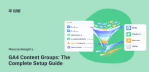
GA4 Content Groups: The Complete Setup Guide
Staring at hundreds of individual page paths in Google Analytics 4 is exhausting. Your “Pages…

Digital Marketing for Small Business: Start Getting Customers This Week
Running a small business is tough. You’ve got a great product or service, but getting…